top of page

Websites & landing pages
Click any of the images below for a more complete view.
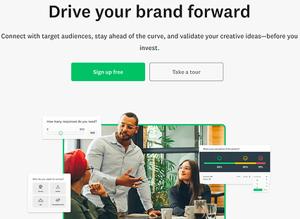
SurveyMonkey — Consideration-stage marketers
For SurveyMonkey, I created a series of twelve landing pages—one for each of the four stages of the sales funnel, aimed at three "ideal customer" profiles. Collaborating with designers and strategists, I leveraged messaging frameworks to develop content that addressed customers' specific needs and concerns, while emphasizing the benefits SurveyMonkey offers each stage. This strategic approach enabled us to provide targeted, relevant content that resonated with our audience and guided them toward conversion.

SurveyMonkey — SurveyMonkey Genius
The SurveyMonkey website emphasizes the powerful features of its platform, one of which is the AI-powered SurveyMonkey Genius. My aim was to explain the feature in a way that highlighted its benefits to customers, focusing on how it can improve their survey analysis experience. Collaborating closely with stakeholders and a visual designer, I created a layout and text for the page that effectively conveyed the value Genius brings to the table.
®

SurveyMonkey — "Same" changer
This landing page was part of a large-scale brand campaign aimed at increasing awareness of the SurveyMonkey name. I worked with a content strategist to build out a wireframe, created all the copy for the page, then collaborated extensively with the design team to create a look and feel that helped introduce potential customers to the SurveyMonkey brand.

Evernote — Home
The Evernote website is built around highlighting the various features of the app. Of these, one of the anchors is "Home," a dashboard allowing customers to see their most important content in one place. My goal for this page was not only to explain the feature, but to do so in a benefit-focused way. I worked closely with stakeholders and a visual designer to create the text and layout for the page.

Evernote — Calendar
Another key feature of Evernote is the ability for customers to connect it to their Google Calendar. Here I worked with a visual designer to create a landing page that clearly explains the benefits, using simple language and a visually appealing layout.

Glassdoor — Post a job
Glassdoor's revenue model depends upon businesses paying to post their open jobs on the site. That makes it essential that the process be as clear and straightforward as possible. In designing the copy and look for this page, my goal was to present exactly the information customers need to make their decision, and no more.
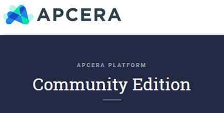
Apcera — Community Edition
What makes a good landing page? It should be obvious at first glance what you're getting, and why you should care about it.
I was guided by those principles as I created the copy and design for this page. It clearly states the benefits of the product, why you need it, and how easy it will be to use. As of July 2016, the Community Edition product had been downloaded over 500 times, so I guess the message got through!

Druva — Cloud-Based Disaster Recovery
Again, the goal of a landing page is to define the product and its benefits. In this case, however, we assumed that the reader already has considerable understanding of the technology. As a result, this page is longer and contains more detail than the previous example. The end goal is the same, though: to clearly express the what, why, and how of the product. I worked with numerous SMEs to make sure that the technical content was accurate, then fashioned a compelling narrative to match.
bottom of page